Finding clarity in a product already in motion.
I joined Cosmic Frog, a supply-chain platform, as Senior Product Designer during development. Across desktop and mobile, I clarified complex workflows and shaped what to build next with client teams.
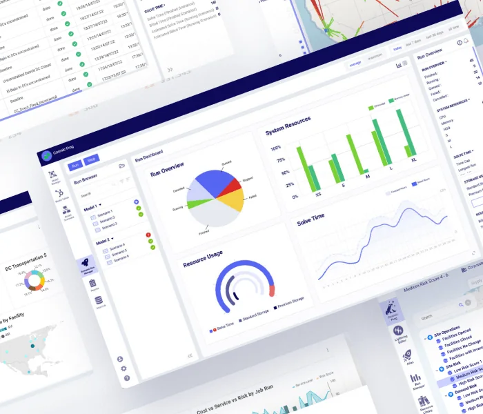
A lot of complexity in one place.
Cosmic Frog brings scenario building, runs, maps and analysis into one product. I worked across that experience, thinking through how each screen could make the next step clearer while keeping the detail needed for supply-chain decisions.
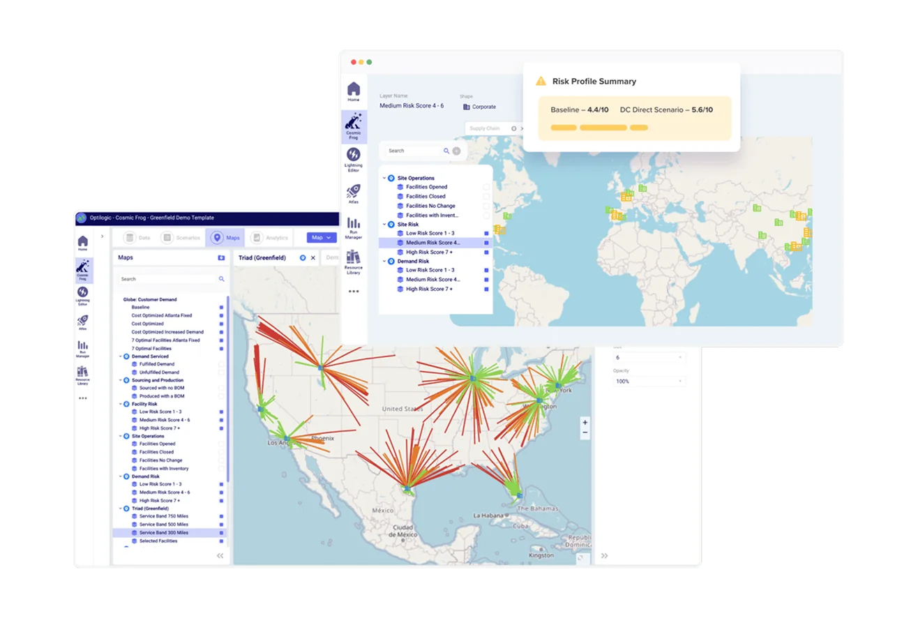
A working product with room to evolve.
I entered the project during development and traced the path from building a scenario in the Workflow Editor to following its run and returning to Home. That gave me a way to decide what information belonged at each point. These earlier screens show the context I worked in, rather than a before-and-after record of every change.
Giving Home a clearer job.
I designed both stages shown here. In the wireframe I explored where run information, recent work and support could live. In the more developed direction I made run states, messages and recent files and runs explicit, so Home could answer practical questions sooner.
The decision: how much belongs on Home?
I weighed the usefulness of showing more information against the risk of making the starting point feel like another analysis screen. The later direction gives status and recent work priority, with detailed scenario work in its dedicated views.
Turning requests into direction.
I led conversations with people from different client departments. Requests did not all point to the same answer, so I worked through what each idea would help someone do and defended simpler choices when extra UI would slow people down or consume time better spent elsewhere.
Bring different departments into the discussion and clarify the work behind the request.
Compare the value of a feature with interface complexity and the design and development time available.
Explain the choice, challenge ideas when needed and leave the team with something it can build.
Runs beyond the desktop.
Scenario runs can continue while someone is away from the desktop. I pushed for a mobile extension because seeing progress, failures and resource use sooner could help people decide what to check next. Run Monitor brought the most relevant run information into that context.
See what is running.
I made active and completed runs easy to distinguish and kept each run's state visible before the details.
Know what needs attention.
Search, filters, resource information and alerts let someone investigate a run when a status alone is not enough.
Designing as a product grows.
My contribution spanned the wider product: refining existing experiences, deciding how to present complex information, leading client conversations and advocating for mobile. The Home designs show a clearer direction for the starting point; Run Monitor shows how the product's run information could travel beyond the desktop.
Let's talk
What are you working on?
Have a project or role in mind? I’d like to hear about it.
© 2026 Marko Razum